


How to Design a Website for Freelance Editors, Proofreaders and Translators
24 August, 2010
By Daniel Heuman
You don't have to spend a lot of money to build a great website. However, you do have to think about your website visitors. Who is using your website? Why? And what's the best way to turn those visitors into clients?
This article answers that in three sections:
- Understanding your visitors
- Common web design mistakes
- Bringing in more visitors
Understanding Your Visitors
Potential customers want to know a few things:
- Do you offer the service that I'm looking for?
- Will you do a good job with my project?
- What will you charge?
- How do I get in touch?
The best way to answer those questions is through the layout of your site. You can explain more with your navigation, headings and images than you can with text.
“We don't read pages. We scan them.” — Steve Krug
The objective isn't to win design awards. Customers aren't looking for the freelancer with the prettiest website. But you should aim to lay out the site so that customers find the answers they seek before they click away. For example, consider Helen Birkbeck's site:
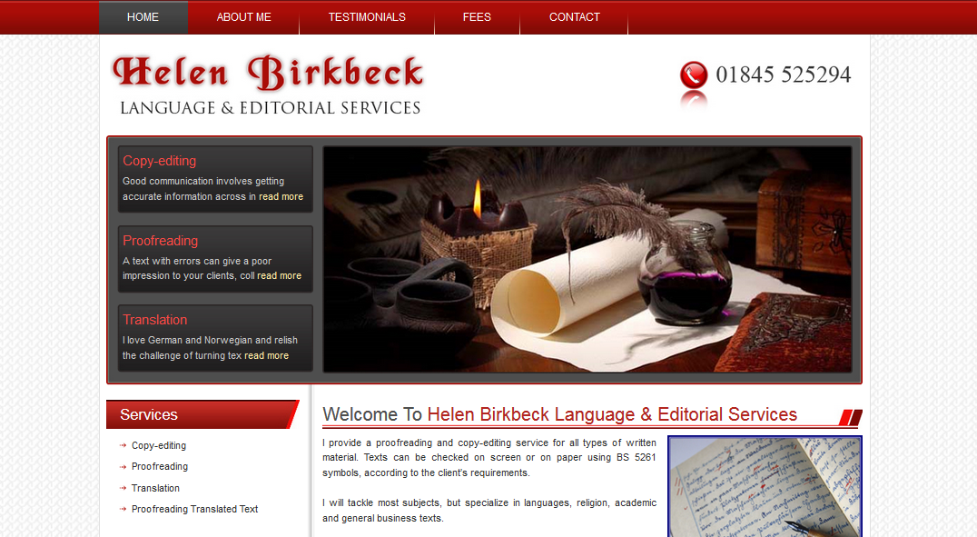 Helen Birkbeck's Language and Editorial Services home page
The eye is quickly drawn to:
- An image that projects quality
- Three core services (copyediting, proofreading and translation)
- A contact number
- Logos of professional affiliations
- A navigation bar that includes the words 'Testimonial' and 'Fees'
When landing on a site like that, website visitors are immediately presented with answers to their most pressing questions. And Helen's site is not unique. Other examples I've come across include: Yours Truleigh Editing, Espirian, hans maerker, Shocking Literary Services, Luke Finley Editorial, and many more. If you get the layout right, and give visitors the assurance that they are looking for, they won't look for another site.
I'll talk about some tips for search engines later. But at the end of the day, not everyone can be ranked top on Google. Does that matter? Not at all. You don't need a search engine when a friend or customer recommends you. But a potential customer will look for you on the internet and check your website. They're looking to see whether your capabilities and prices are right for them, so make the answer to those questions clear. There's no need to publish your actual rates if you don't want to, but at least explain how visitors can get a price from you.
Common Web Design Mistakes
I don't like to dwell on the negatives, but a few things stand out as easy errors that you can fix.
Not creating a website: This is possibly the most common (and definitely the most grievous) of all errors. It was the most common error when I wrote the first version of this article in 2010. Now it's 2015. Websites don't cost much, they're easy to produce (the days when you had to learn HTML are over), and they help give potential clients the reassurance that they're looking for.
Not updating your website: Your website is a listing, so there's no need to update it often. But if you haven't done it since 2006, it probably looks out of date. It's time to take a fresh look and make sure you project the image that you want.
Too much text on your homepage: How many words do you have on your homepage? If your site is mobile-friendly, how many words do you have 'above the fold'? Is it under 100? Under 200? Have you gone over that? If so, ask yourself why. The fewer words you have, the more likely visitors are to explore the rest of your site. For example, instead of putting a life history on the homepage, put it in a page called 'About'. Look how in just 50 words Monique Choy's Nettle Soup draws visitors to the words 'copywriting', 'editing' and 'proofreading' and they'll naturally follow to 'services', 'clients', 'samples' and 'contact'. And bear in mind this is the 2010 design. Her current site is better (albeit harder to include in a screenshot since it encourages scrolling down).
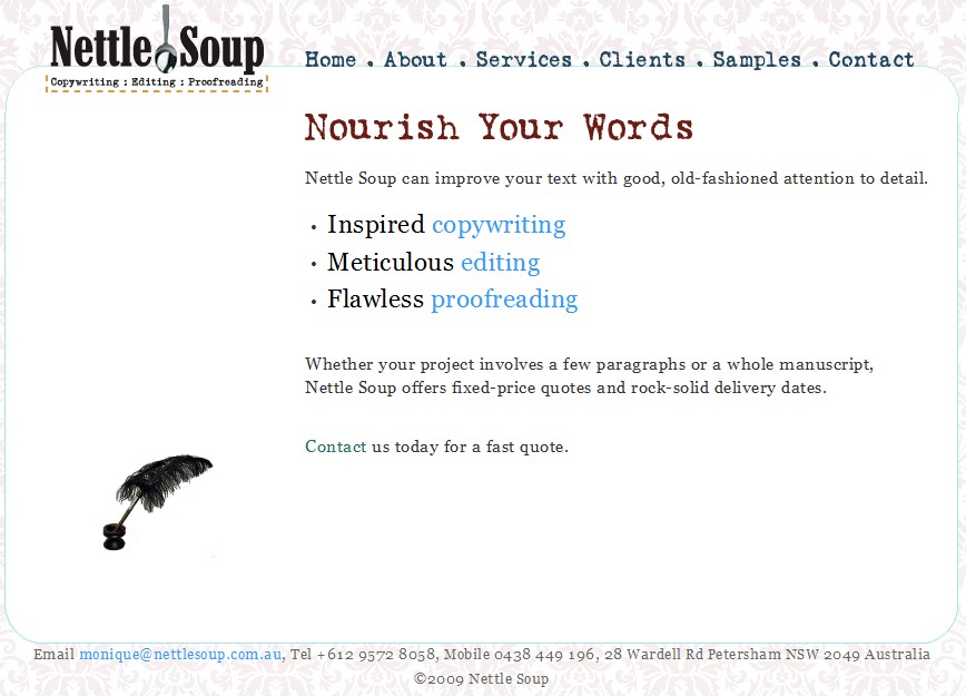 The Nettle Soup home page
Not including a client list: Nothing says more about your capabilities than a list of your past clients. Make sure you get permission first and then put the list somewhere obvious.
Member of a professional society? If so, say so prominently. Why join, stick to the code of practice and then not display the logo?
Bringing in More Visitors
Not everyone can come out on top in a Google search for proofreaders, editors or translators. But you can easily improve your rank in the results by listing your business on websites. Intelligent Editing offers a free listing for past customers and other sites do too.
Even if you can't come out on top of a Google search for 'translator', 'proofreader' or 'editor', think about the other searches that customers might try:
Geographic searches: Potential customers might use Google to find someone local. For example, they might search for 'proofreader in London'. Make sure your city, region, postcode and country are all mentioned on your site.
Service-based searches: Do you specialize in a particular type of editing? If so, make it clear. A potential customer may look for 'medical editor' instead of just 'editor', so make sure that your services are listed to include that.
Searches by style guide: If you use certain style guides particularly often, say so. If a customer searches for 'proofreader AP Style' it won't help if your website says that you "work with all style guides".
Finally, try to be innovative. Editors specializing in business documents in Australia take advantage of their location by offering 'overnight editing' to clients in Europe. With Skype-In you can offer a local phone number to clients in any country. Think about what other steps you can take to attract new customers. Because once someone finds a great proofreader, editor or translator, they'll stick with you.
Daniel Heuman is the founder of Intelligent Editing. He has visited hundreds of proofreading, editing and translating websites as part of the marketing of PerfectIt.